
9 min read
The Anatomy of a Poster That Sells
.png)
A movie poster is a marketing constraint disguised as design. It has to make genre and tone legible in seconds, and it has to do it without the benefit of motion, dialogue, or context.
That is exactly why key art has always been such a powerful form of marketing. When it works, it does something rare. It compresses a two hour experience into a single image that people can recognise, remember, and talk about. It also has a strange double life. It sells the film, but it can also become part of culture, something people collect and treat like an object in its own right.
What makes a poster sell is not one universal style. It is a set of marketing moves that the best designers execute with discipline. If you are trying to understand modern entertainment marketing, posters are still one of the clearest places to start, because they show you how a campaign chooses a promise and commits to it.
A poster sells a promise, not a plot.
The first job of key art is not to explain the story. It is to make a promise about the experience. The viewer should understand what kind of film this is and what it will feel like before they read a single line.
That is why Jaws (1975) still gets referenced. It does not rely on copy to persuade. It uses scale and composition to make the premise felt in your body. A small swimmer, an enormous threat, and a calm surface that suddenly looks like a lie. You do not need context to understand what you are being invited into.

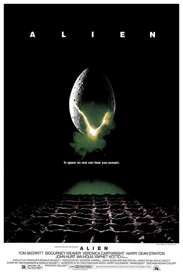
Alien (1979) sells the same way, but through restraint instead of scale. The teaser poster with the egg and the crack is basically a controlled hint. Most of the frame is darkness, and that darkness forces your eye to the one glowing break. The promise is not “here is the creature.” The promise is “something is coming, and it is not going to be kind.” The marketing works because the image triggers imagination, and imagination is always more persuasive than explanation.
This is also why modern key art that performs well often feels concept-led rather than information-led. A good recent example is Spencer (2021). The key art captures the film’s emotional pressure in a single image, and it pulls you in without trying to explain the story. The viewer does not need a synopsis. They need a sense of mood and stakes.

A quick test would be to ask yourself what promise the poster is making in one sentence. If you cannot say it cleanly, the poster will usually drift into being “about the film” rather than selling the experience of watching it.
Posters win with one clear idea and a strong focal point.
The second job is attention control. A poster is not a place where viewers politely scan every element. Your eye lands somewhere first, then either stays long enough to decode the rest or moves on. That first landing spot matters. Designers call it the focal point, and it is one of the most practical concepts in poster marketing because it determines whether the promise actually lands at speed.
At their best, movie posters distill a film down to one clear idea, often by combining a small number of motifs to show rather than tell. That is the heart of it. One clear idea. One clear place to look first.
This is where a lot of contemporary posters weaken themselves, especially in the era of streaming tiles. When you ask one image to carry concept, cast, spectacle, release date, and critical positioning, you often end up with multiple competing focal points. The viewer’s eye bounces, meaning does not land, and the poster becomes something you glance at without absorbing.
Cast-forward key art can still work when star power is the product, but the risk is that the focal point becomes “faces” rather than “idea.” In marketing terms, that shifts the strategy from intrigue to recognition. Recognition is useful, but intrigue is what makes a viewer choose you over the next option in the grid.
The risk is visible in how people reacted to the Euphoria Season 3 (2026) poster. The pushback was not really “floating heads are bad.” It was that the poster felt like it was selling the cast without selling the season’s mood. Fans are used to Euphoria having a very specific visual identity, gritty, intimate, emotionally tense, often with a photographic realism and edge. When the poster leaned more generic and glossy, people read it as a signal that the season might feel different. That is the real problem with cast-led key art when the “idea” is missing. If the poster does not clearly communicate tone, audiences create their own explanation for what it means.

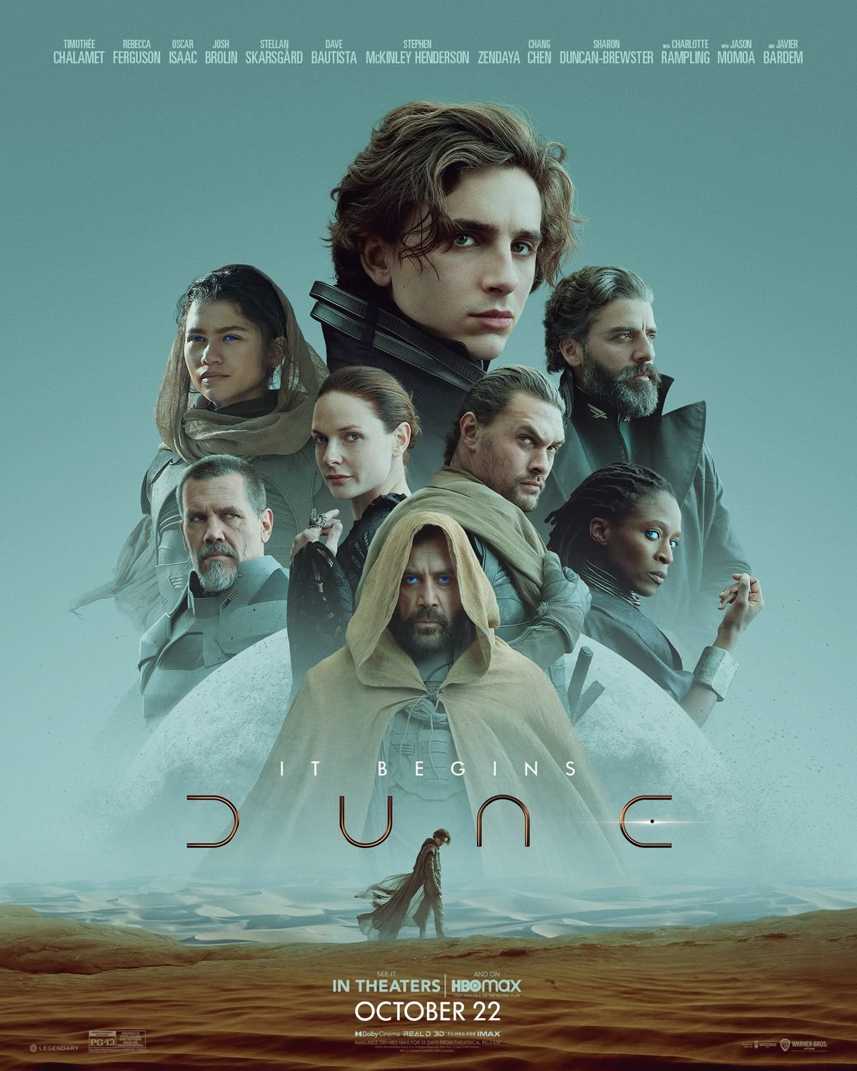
A cast-forward poster can still work when the faces are organised around a clear idea. Dune (2021) does this more successfully because it is not just “here are the actors.” The imagery sells a world and a scale, harsh desert, heat, danger, epic seriousness, and the characters are placed inside that atmosphere. Even if there are multiple faces, the poster still gives you something stronger than recognition to remember. It gives you a distinct mood and setting. So the focal point is not only the cast, it is the promise of the experience.
The practical takeaway is that cast-led key art should still give the viewer a single thing to hold onto that is not a face. A colour world, a symbol, a piece of setting, a compositional rule, anything that makes the poster recognisable at a glance and repeatable across the rest of the campaign. When that “idea layer” is present, the cast reinforces it. When it isn’t, the cast becomes the whole message, and the poster stops functioning as a promise and starts functioning as a roll call.
.png)
Typography is marketing, not decoration.
People talk about posters as images, but typography often decides what the image means. It tells you whether the film is sleek or grimy, ironic or sincere, intimate or epic. It also controls readability at distance, which matters because a title that cannot be read quickly is a poster that cannot be remembered.
A clean example is Se7en (1995). The title treatment looks distressed, uneven, and hand-made, like it belongs to a notebook rather than a studio asset. That choice does two things at once. It sets tone, because the lettering feels nervous and obsessive. It also sets expectations, because nothing about that type looks “safe” or polished. Even before you understand the story, you understand the atmosphere the marketing is selling.

This is why title design is not just “pick a font.” It is a branding decision for the entire campaign. The title treatment is one of the few assets that appears everywhere unchanged, including poster, trailer end card, streaming tile, and social thumbnails. When it is specific, recognition builds quickly. When it is generic, the campaign relies on the image alone to do all the remembering, and that is harder than it needs to be.
Great key art understands where it will live.
Posters do not live in just one place anymore. The same key art has to work on a cinema wall, on a phone screen, and as a tiny tile on streaming platforms. Those are very different viewing conditions. In a lobby, someone can stand and look. In a scroll, you get a second. In a streaming grid, you are competing with hundreds of rectangles at once.
That shift changes what “good” looks like. Detail that feels rich in print can turn into visual noise when it shrinks. Subtlety that feels clever up close can disappear completely at thumbnail size. This is why modern campaigns often succeed when they commit to one visual idea that stays readable when it’s small, and then repeat that idea consistently across formats.
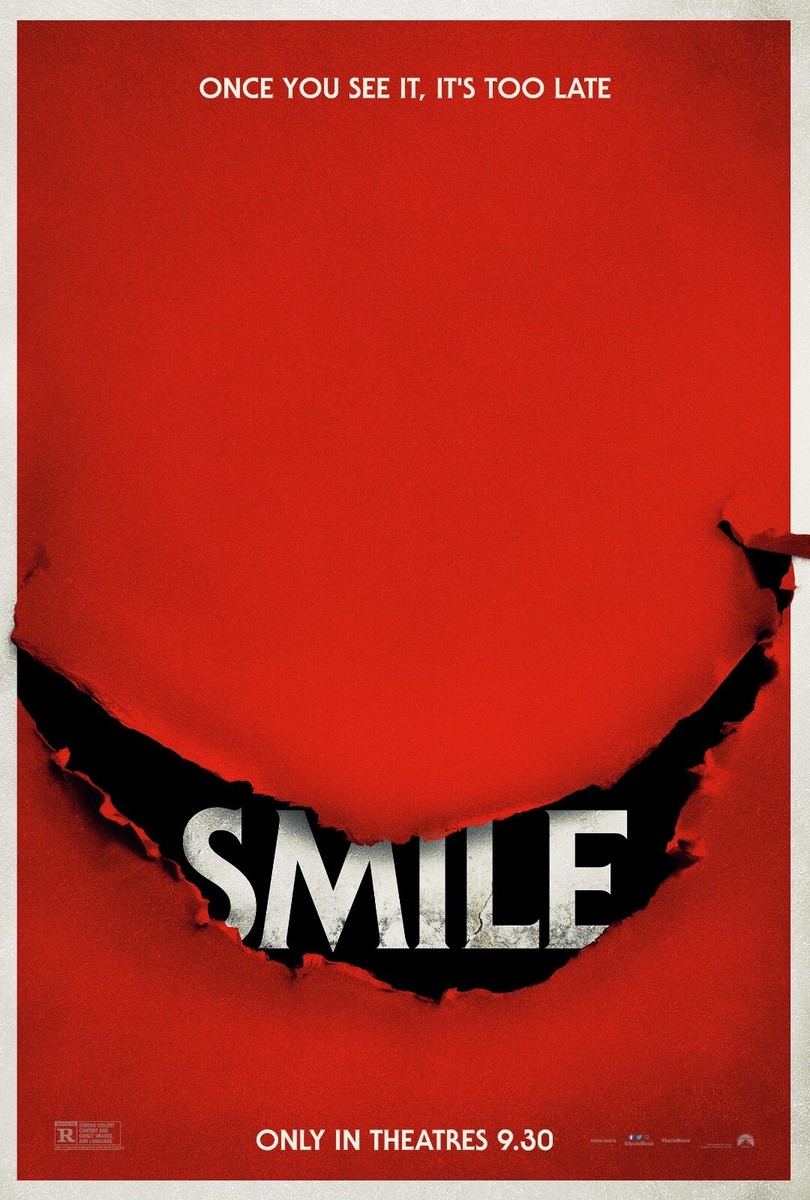
A strong recent example is Smile (2022). The key art leans on one unsettling motif that reads instantly, even when you see it briefly or at a small size. You do not need context, character names, or plot. You register the feeling first, which is exactly what you want in a grid. That consistency is not just a design preference. It is a distribution advantage. When the same visual signal keeps showing up across placements, recognition builds quickly, and recognition buys you the extra moment of attention that makes someone click.
This is also where “less is more” stops being an aesthetic choice and becomes a marketing strategy. If the key art is built around one clear signal, it travels. If it relies on lots of small elements to explain itself, it collapses when it shrinks. Posters that sell today are often designed with that reality in mind: one idea, readable fast, scaled everywhere.
If you are building a campaign, the poster is the asset that tells you whether you actually know what you are selling. Not in a philosophical way, in a practical one. If you cannot choose a single promise and express it in one frame, you will spend the rest of the campaign trying to make up for it with more explanation, more versions, and more assets that still feel slightly uncertain. That is usually when marketing starts to get noisy. The brief expands. The key art gets safer. The trailer starts doing the work the poster never did. The social cutdowns become mini synopses. And on the platforms that matter most now, where people are making decisions at thumbnail size, nothing lands cleanly.
A strong poster prevents that chain reaction because it creates a spine. Once you have one image that communicates the experience instantly, every other piece of marketing becomes an extension of a clear decision. Your trailer can build tension instead of setting context from scratch. Your streaming tile can be a simplified crop of the same idea rather than a different story altogether. Your outdoor can amplify one moment instead of cramming five. Your social can remix and repeat, which is how recognition builds, especially when audiences encounter the campaign in fragments across different surfaces.
This is also why poster discipline matters more now than it did when posters primarily lived in lobbies. Today, key art is often the first contact point with a film, and it is competing inside grids and feeds where viewers are not “considering.” They are filtering. In that environment, the job is not to be comprehensive. It is to be unmistakable. The campaigns that travel tend to be the ones that can be understood fast, remembered easily, and recognised again when you see a variation two days later.
Movie posters still matter because they are built for the way films are discovered now: quickly, visually, and at small size. Great key art makes recognition effortless, and that recognition is what turns a passing glance into a click, and a click into a watch.
Related Blogs
Explore helpful articles, ideas, and industry perspectives designed to deepen your understanding of design, strategy, and digital growth.
.png)